When you see "over time" in requirements, the first instinct is usually a line chart or a bar chart. But when thinking about time, most people don't actually visualize it as a straight line - they visualize it as a calendar grid. That's how schedules, deadlines, and patterns live in the brain.
A calendar heatmap gives you a day-by-day breakdown - clear, concise, and perfect for spotting patterns that a line chart completely hides: which weekdays are consistently high, which weeks in a month are outliers, how a metric behaves across a full year at once.
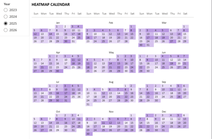
The result - a full-year calendar with gradient heatmap, built entirely with the native Matrix visual.
When this is the right visual
📊
Sales performance
Spot high and low days across months and quarters. See seasonality at a glance.
⚠️
Incident frequency
Identify high-volume operational days. Find recurring problem patterns by weekday.
📅
Any daily metric
Website traffic, support tickets, production volume - anything with daily granularity benefits from this view.
🔍
Pattern detection
Weekly, monthly, and quarterly cycles become immediately visible. Line charts hide these patterns.
02Data model setup
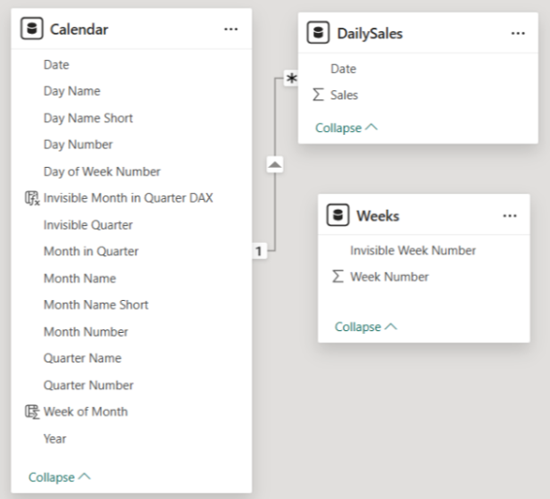
The calendar heatmap requires three tables. The key insight is the Weeks table - a simple helper that enables the Matrix to render week rows correctly inside each month.
Data model - three tables connected to build the calendar structure.
Calendar Table
REQUIRED
Your standard date table containing all dates for the period. Needs to include: Date, Day Number, Day Name Short, Month Name Short, Month Number, Week of Month, Quarter.
Weeks Table
REQUIRED
A simple helper table with week numbers 0 through 6. Week 0 is special - it's used to display the month name in the matrix, not actual day numbers. This is the trick that makes the layout work.
DailySales (your metric table)
YOUR DATA
Your actual data table with a metric at daily granularity. Replace this with whatever you're measuring - incidents, visits, transactions. The structure is the same: one row per day, one metric column.
03Matrix configuration
The calendar layout is achieved by configuring the Matrix visual with specific row and column fields. Several of these are intentionally invisible - they control the structure without showing labels.
Rows
Quarter (invisible) · Week Number in Month (invisible) Quarter groups months; Week Number creates the week rows inside each month.
Columns
Month Number in Quarter (invisible) · Week Day Name Month Number groups the columns by month; Week Day Name gives you Mon-Sun columns.
Values
Calendar Value - the DAX measure from the next section This measure handles both day numbers and month name labels in one field.
💡
Making fields invisible: set the field's display format to no value, or simply turn off the header labels in Matrix formatting. The fields still control the structure - they just don't show text.
✅
Hide expand/collapse icons in Matrix row headers via the Row Headers formatting option. This gives a much cleaner calendar look - no +/- buttons cluttering the left side.
04The DAX measure - how it works
One measure drives the entire calendar display. It handles two jobs: showing the month name in the header row (Week 0), and showing the day number in all other cells. Here's the full measure with comments explaining each branch.
DAX - Calendar Value measure
Calendar Value =
VAR _MonthName = SELECTEDVALUE('Calendar'[Month Name Short])
VAR _day =
FORMAT(
CALCULATE(
SELECTEDVALUE('Calendar'[Day Number]),
'Calendar'[Week of Month] = SELECTEDVALUE(Weeks[Week Number])
),
"0"
)
VAR _DayCountWeek =
COUNTROWS(
INTERSECT(
VALUES(Weeks[Week Number]),
VALUES('Calendar'[Week of Month])
)
)
RETURNSWITCH(
TRUE(),
-- Week 0 + Wednesday column: show the Month NameSELECTEDVALUE('Calendar'[Day Name Short]) = "Wed" &&
SELECTEDVALUE(Weeks[Week Number]) = 0,
_MonthName,
-- No days exist for this week number: blank cellISBLANK(_DayCountWeek),
BLANK(),
-- Week 0 (non-Wed) or multiple Day Name values: blankSELECTEDVALUE(Weeks[Week Number]) = 0 ||
NOT HASONEVALUE('Calendar'[Day Name Short]),
BLANK(),
-- Default: return the day number
_day
)
How the SWITCH logic works
1
Month name in header row
When Week Number = 0 and the column is Wednesday, the measure returns the month name (e.g. "Jan"). Wednesday is chosen because it's visually centered - the name appears in the middle of the week columns.
2
Empty cells for non-existent weeks
Some months have 4 weeks, some 5. If a week row has no days in the calendar (the Weeks table goes to 6), the measure returns BLANK() - the cell stays empty and clean.
3
Blanks for remaining Week 0 cells
Week 0 cells that are not Wednesday also return BLANK(). Only the Wednesday cell gets the month name - all others stay empty.
4
Day number for everything else
All other cells return the actual day number (1-31), formatted as a string with "0" format to avoid decimal display.
05Formatting and tips
🎨
Heatmap coloring: add your actual metric (e.g. DailySales[Revenue]) to the Values field alongside Calendar Value, then use Conditional Formatting on the cell background. Choose a gradient from light to your accent color - this creates the heatmap effect automatically.
⚙️
Changing granularity: the same model works for weekly, sprint, or monthly views - just swap what's in the Row fields. The Calendar and Weeks tables stay the same.
📐
Adding metrics: the Matrix is fully flexible - add status columns, SLA flags, or comparison metrics alongside the Calendar Value. The structure supports any number of value fields.
⚠️
Performance note: for very large datasets (multi-year, high-cardinality), scope your Calendar table to the relevant period using slicers or report filters. The Matrix renders all visible cells - fewer dates = faster load.
✅
Why no custom visuals: no update dependencies, no Marketplace security reviews, no performance issues at large data volumes. Enterprise IT will approve this without friction. The Matrix is a first-party visual that's been in Power BI since day one.
A calendar grid in your head - now in your report.
The result is a clean, calendar-like grid with gradient-based heatmap, giving users the ability to quickly spot trends and patterns within large time spans. Built entirely with standard Power BI - no dependencies, no risk, no Marketplace approvals needed.